Tarte is a leading beauty brand that prides itself in using all natural ingredients. They are looking to elevate their current design, and move to a different web platform to better support their growth.
My Role: UX/UI Design, Prototyping
Tools: Figma
Team: Designers, Developers, Functional Architects, Client Stakeholders
The Problem
Tarte is growing quickly on social media channels, and needs to elevate their site design to support this growth. They are looking to improve the overall customer experience with this platform migration, draw in Gen Z customers, and refresh their look to compete with other top beauty brands.
The Goal
Optimize tartecosmetics.com through design and UX best practices by:
· Creating an elevated brand experience that is modern and simple with a strong identity appealing to their target audiences
· Using a mobile first approach
· Establishing a clear, concise messaging hierarchy
· Educating customers on Tarte’s brand mission and values
· Exploring industry best practices to optimize customer path to purchase
· Leveraging the efficiencies and features of the SFRA platform
Discover
To start, the design team needed to get some clarity around the user’s needs, pain points, and the current landscape of the beauty industry.
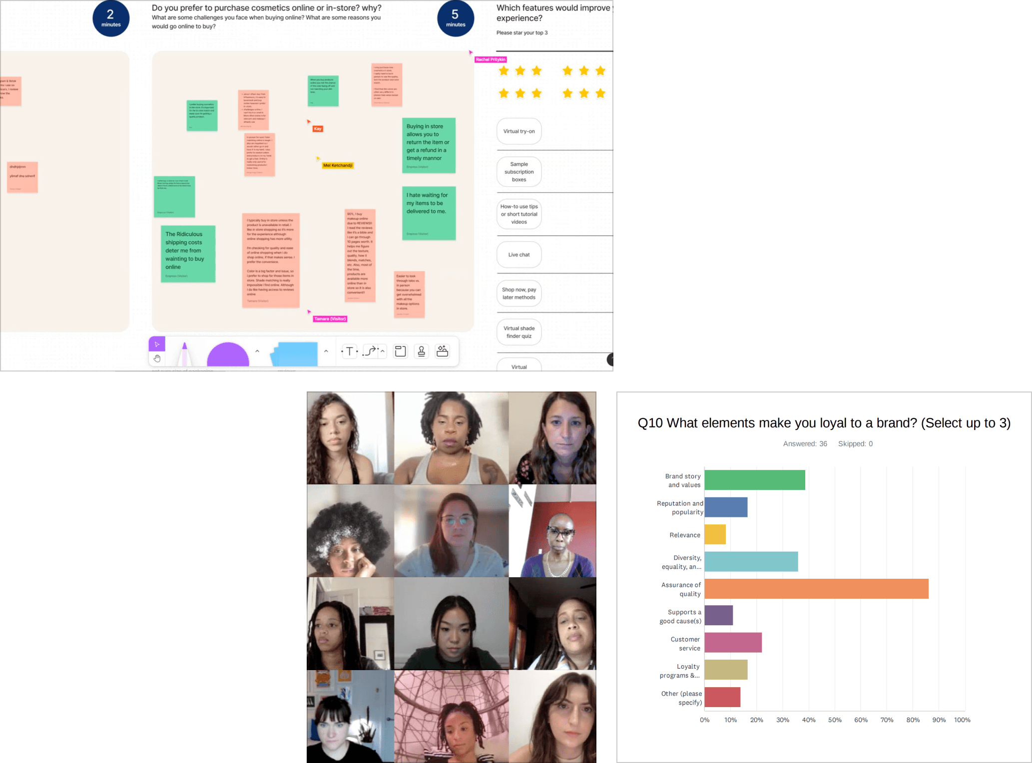
We conducted extensive competitor research to better understand the best practices and design patterns Tarte was looking to implement. Using the information we gathered, we held workshops with the Tarte team to help us identify challenges and aspirations. We also put together focus groups and sent out online surveys to gain a stronger sense of who our users are and how they shop for cosmetics, so we can better advocate for their needs.
Guerilla Research
We conducted live focus groups to collect qualitative data and executed online surveys to gather quantitative data.
Ideate
After getting a better understanding of how the user discovers and shops for beauty products, what the Tarte team was looking to improve, and what their competitors are doing, it was time to start exploring some design solutions. We were working on the visual and UX simultaneously; nailing down a new, elevated design direction, and figuring out how we can implement new features.
Based on our research, there were a few areas we found were key:
· Increase focus on social media content integration and customer referral programs to bolster consumer confidence and drive more product sales.
· Many of their users are coming in from social channels or to repurchase products. It should be as easy as possible for the user to find what they need, and check out.
· Focus on ease of use, transparency, communication, and supporting content.
· Expand content use related to company values, product quality, and DE&I to increase acquisition and brand loyalty.
· Use natural colors in combination with clean design aesthetics. Use model & product photography that is modern, diverse, and natural, yet approachable.
Wireframes
Mid-fidelity wireframes helped guide our conversations with the Tarte team. They allowed us to explain the reasoning behind our recommendations, and offered a quick way to iterate feedback before moving into visual designs.
Challenges
We quickly learned that there were many conflicting voices coming from the Tarte team. It was a challenge to keep our discovery and design sessions streamlined. Their current site was also changing every 2 weeks or so while A/B testing new concepts. Our team had to constantly adapt to changing needs, so we created a consistent, detailed presentation guideline to follow in our sessions.
Design
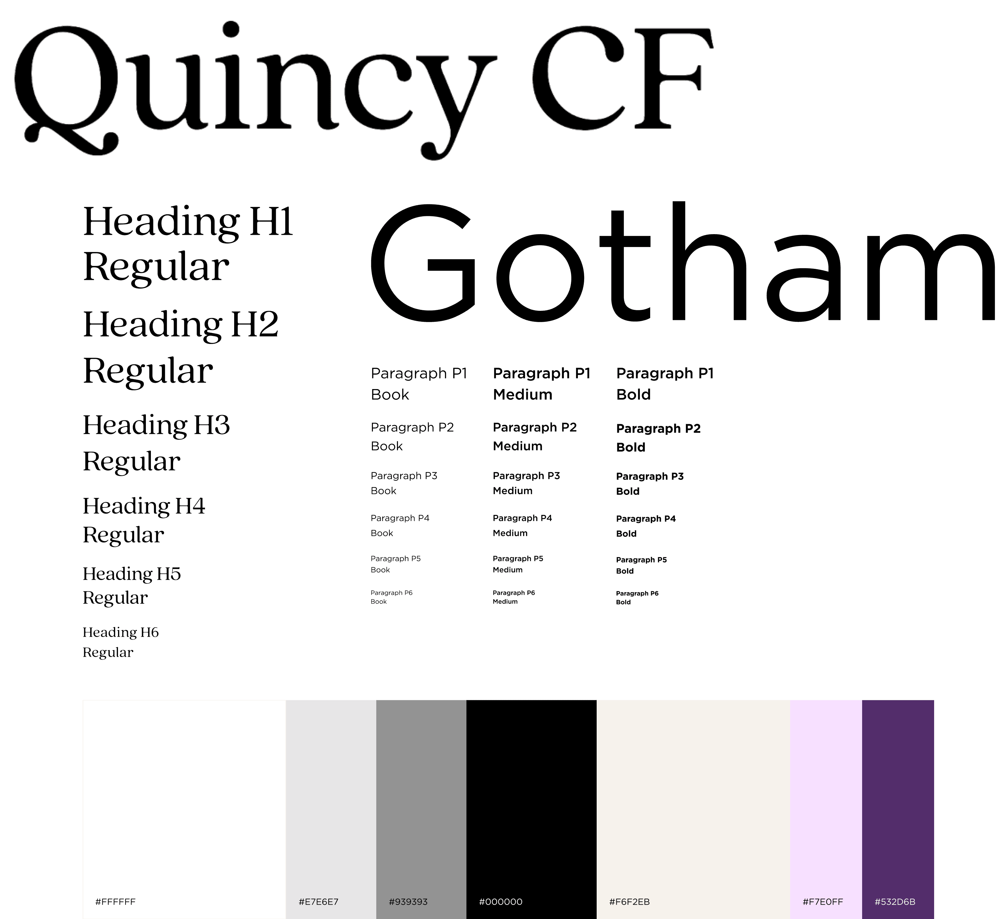
Elevating Tarte’s design identity was another key component of this project. Based on competitive research and feedback from users, we landed on a clean design that highlighted the brands emphasis on all-natural ingredients.
We built a new design system to clearly document how we utilized the new type styles, colors, layout, and components.
The Outcome
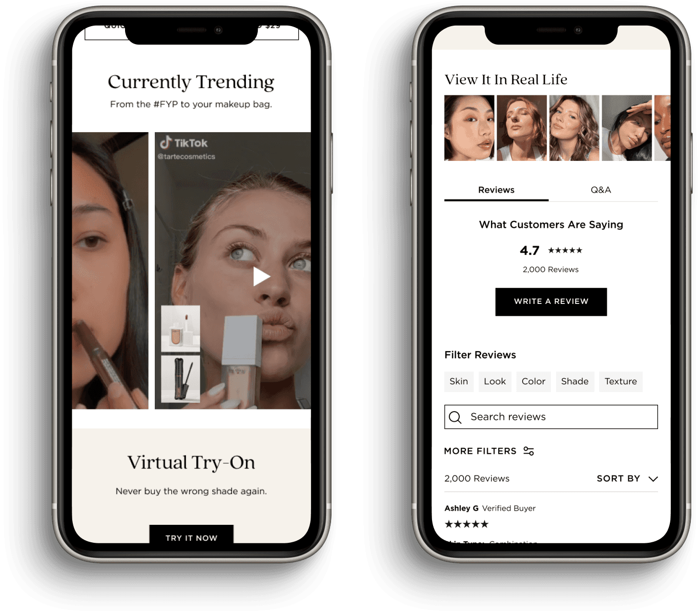
“From the #FYP to Your Makeup Bag”
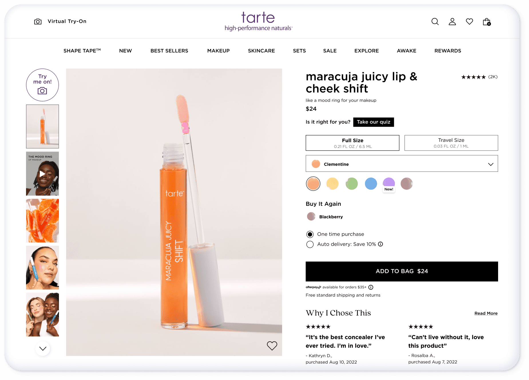
We introduced new ways to feature social content throughout the site. Tarte acquires most of their Gen Z audience through TikTok, so including this was key. Through our user research, we also found that shoppers love to see how products are used through video when purchasing online. We recommended Tarte to incorporate more user generated content within their product page, alongside the clean product and model shots.
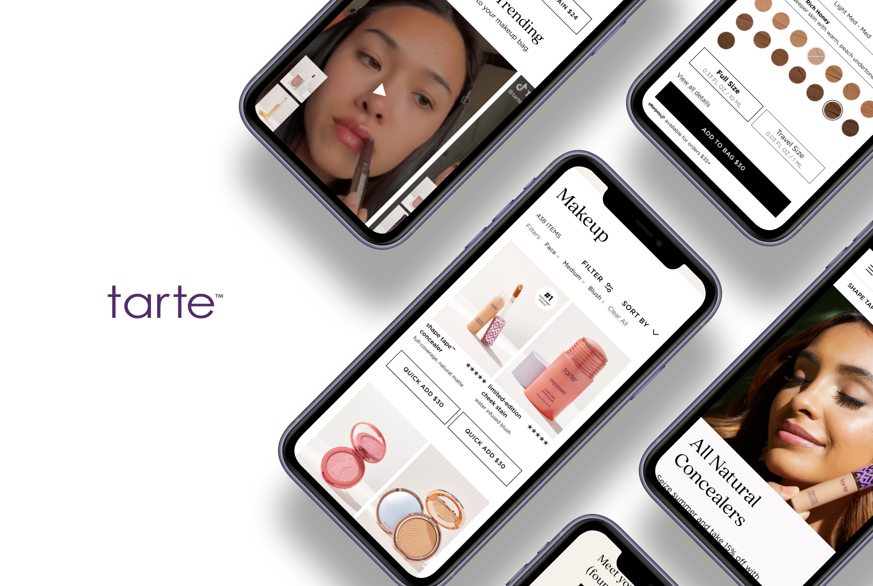
On the homepage, we introduced a “Currently Trending” section. The user can watch featured videos from users and influencers, and shop the featured products directly from there.
Quick Add to Cart
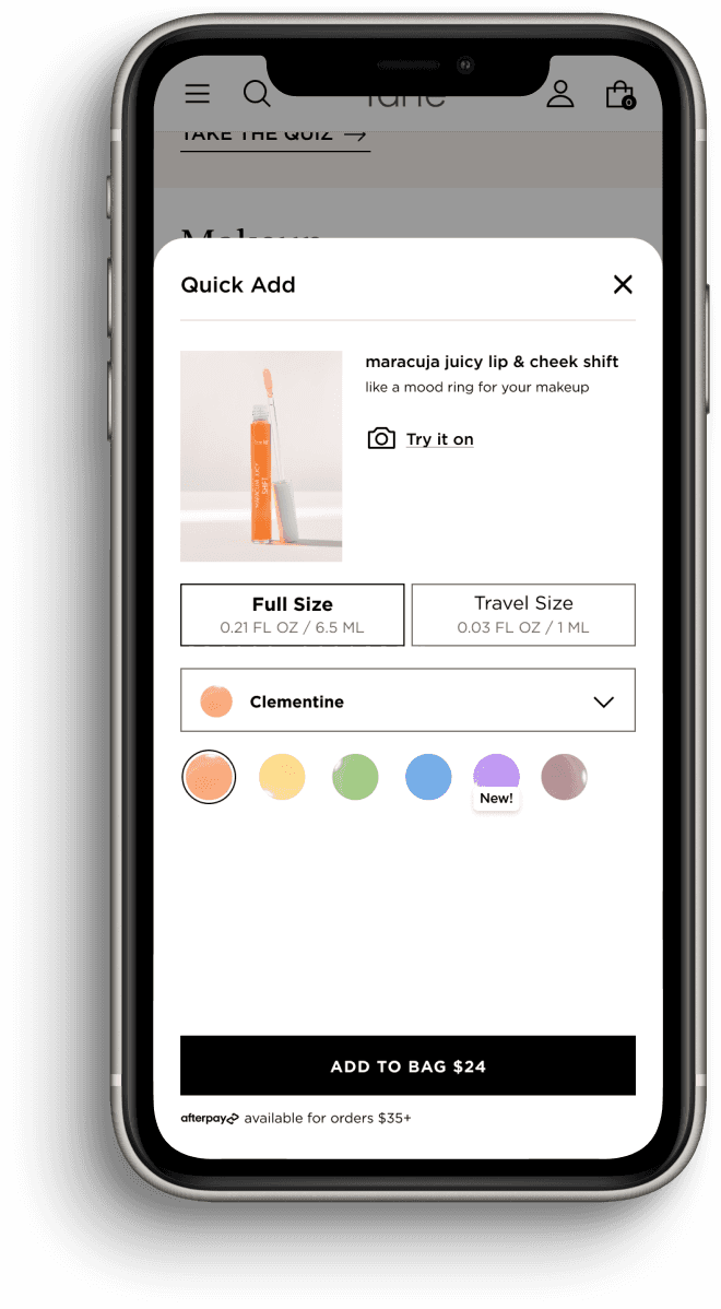
We introduced a quick add feature where the shopper can add products straight to their cart from any page where products are listed.
Through A/B testing, we found that most users don’t read long descriptions on the product detail page. We were able to pick out all the critical information needed to make a purchase, and include those in quick add.
Some products have multiple size variations and over 30 shades, so presenting this information in a clear way created a new challenge. We landed on a design that showed all information necessary to add a product to your cart without overwhelming the user.
