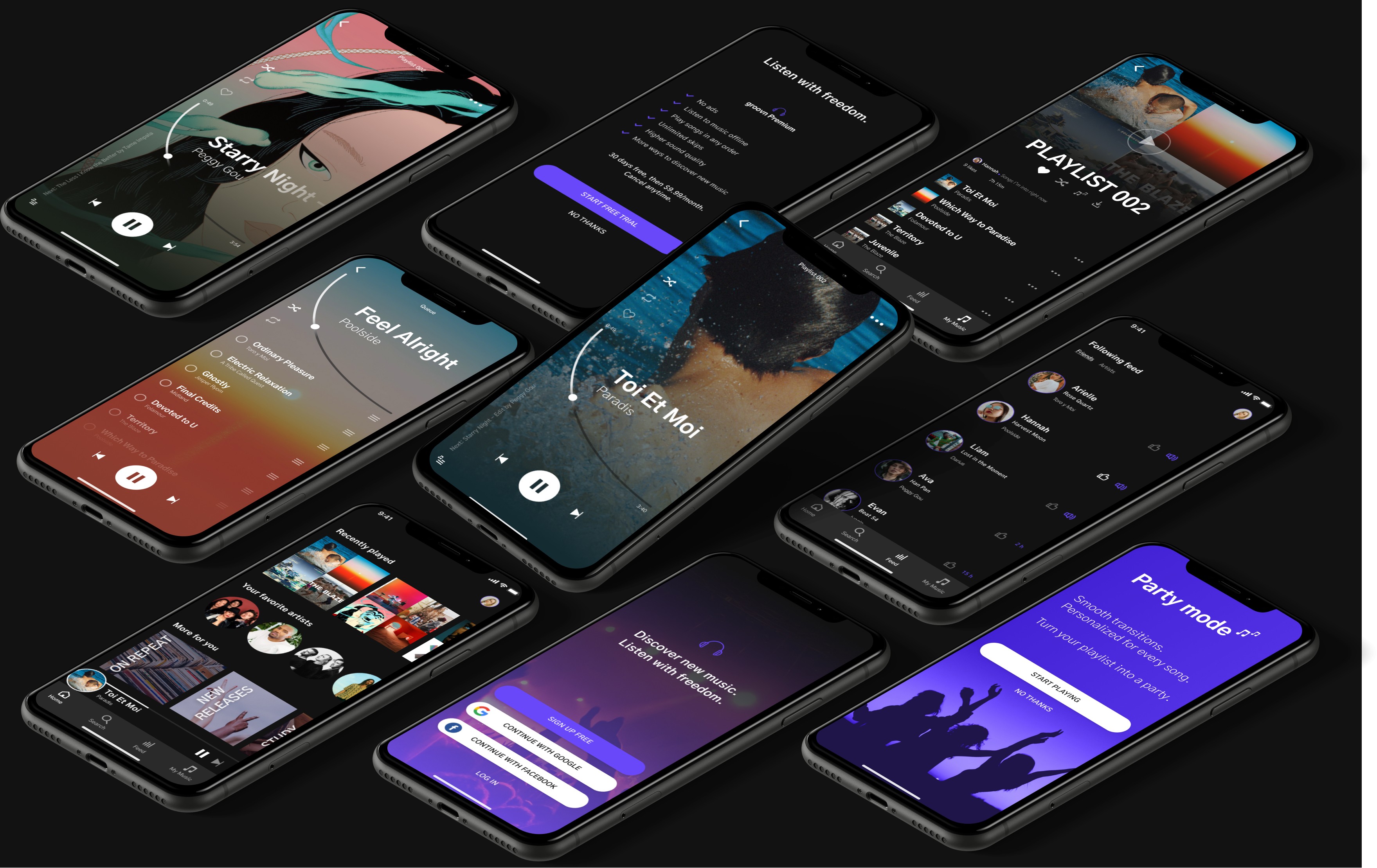
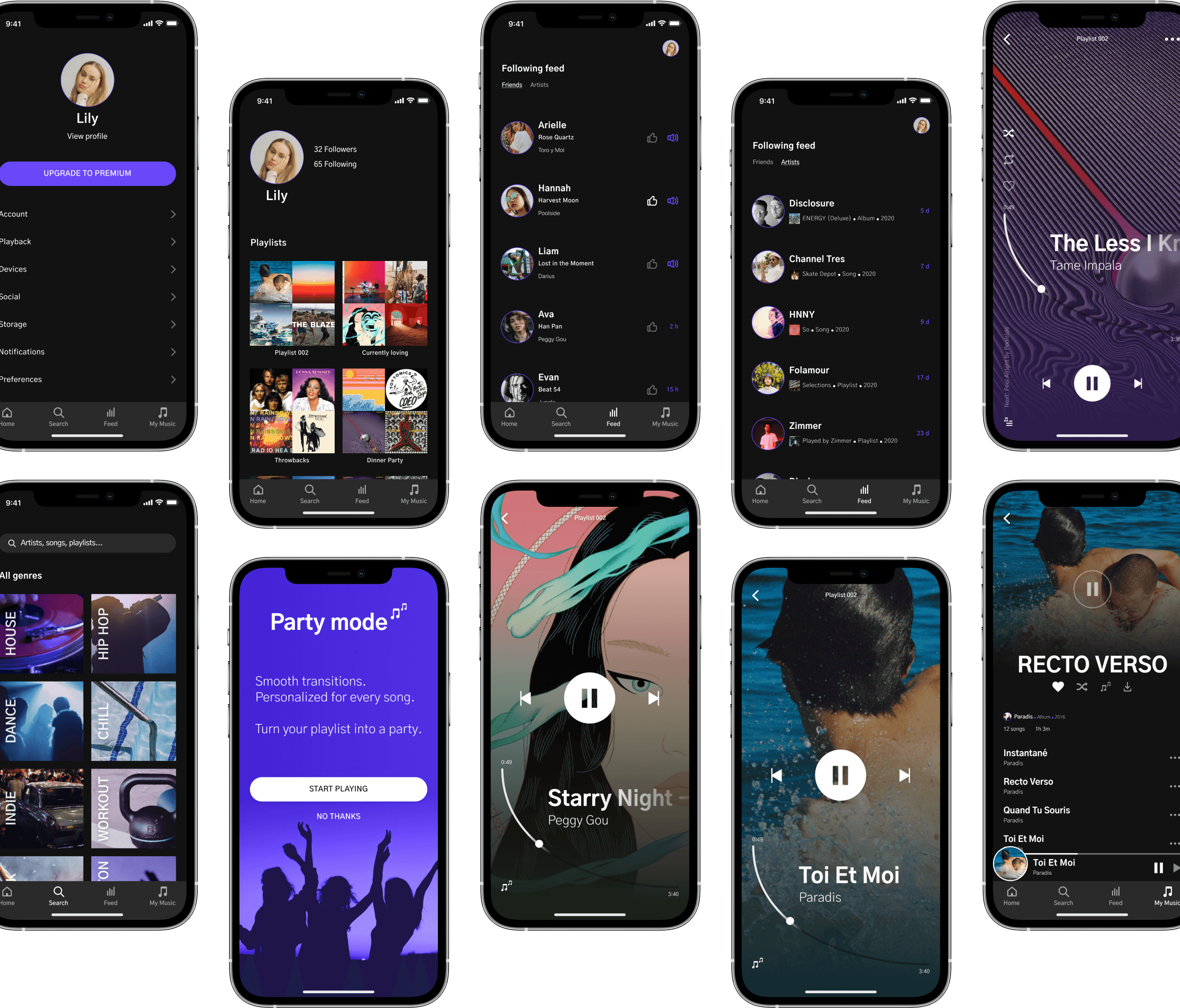
Groovn is a music streaming product that has been running on a freemium model for the past two years. They are looking to evolve their features to be able to monetize on a premium version of the app.
My Role: UX/UI Design
Tools: Figma
Team: Just me!
The Problem
Groovn's business strategy was to first build a user base by offering a free product, and then evolve the feature set so they could monetize on a premium product. At this point, the product has been well received and has a healthy base of free users. The existing flow does not have prominent calls to action throughout the free experience that gives the user the opportunity — or a compelling reason — to subscribe.
They now need to design an experience that will allow users to subscribe and pay a monthly fee.
The Goal
- Create the opportunity for new users to subscribe to the premium product upon registration in the signup flow.
- Create the opportunity for returning free users to become paid subscribers within the product.
How might we introduce a premium plan that is worth signing up for without losing existing users?
Discover
What Makes Users Want To Upgrade?
Given the short time frame for this project, I decided to conduct competitor analysis and user research to gain insights on how to best implement the paid feature on the app. First, I looked at three major competitors to see what they offer in their premium vs free versions, and the call to actions they use to get the user to sign up for a premium account.
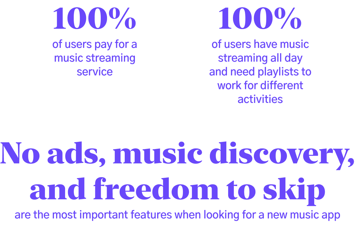
Then, I spoke to users of these apps to gather some insights about why they pay for their music streaming service of choice, and how they typically use their app.
User Flows
Based on the feedback of everyone I spoke to, I created a user flow chart to visualize how the users will complete the task of upgrading their accounts to premium. I placed calls to upgrade on key screens, so it's always accessible to the user.
Wireframes
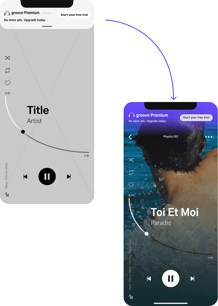
To save time, I went straight into creating mid fidelity wireframes. This would allow me to conduct the most realistic user testing before moving on to high fidelity.
User Testing Findings
Overall feedback was great! The users had no issues completing the flows.
There was one challenge that came up about the upgrade banner that appears on certain screens if they chose not to upgrade to premium. Some users were okay with it, some said it could deter them from using the app completely.
I was faced with a new question; How much is the user willing to be annoyed by being told to upgrade while using the free version, before they decide it’s not even worth it to use the app? What visual barrier is convincing enough to the user to make them want to upgrade?
Design
I wanted the user to have a very visual experience while using the app. Using album artwork as a focus point helps to keep the aesthetic bold and clean.
"Uniquely diverse, bold, hip, smart, but somehow always familiar"
The Outcome
Creating a Free Account
Signing up for a free account is simple; the user can choose to enter in their information or sign up via their social account.
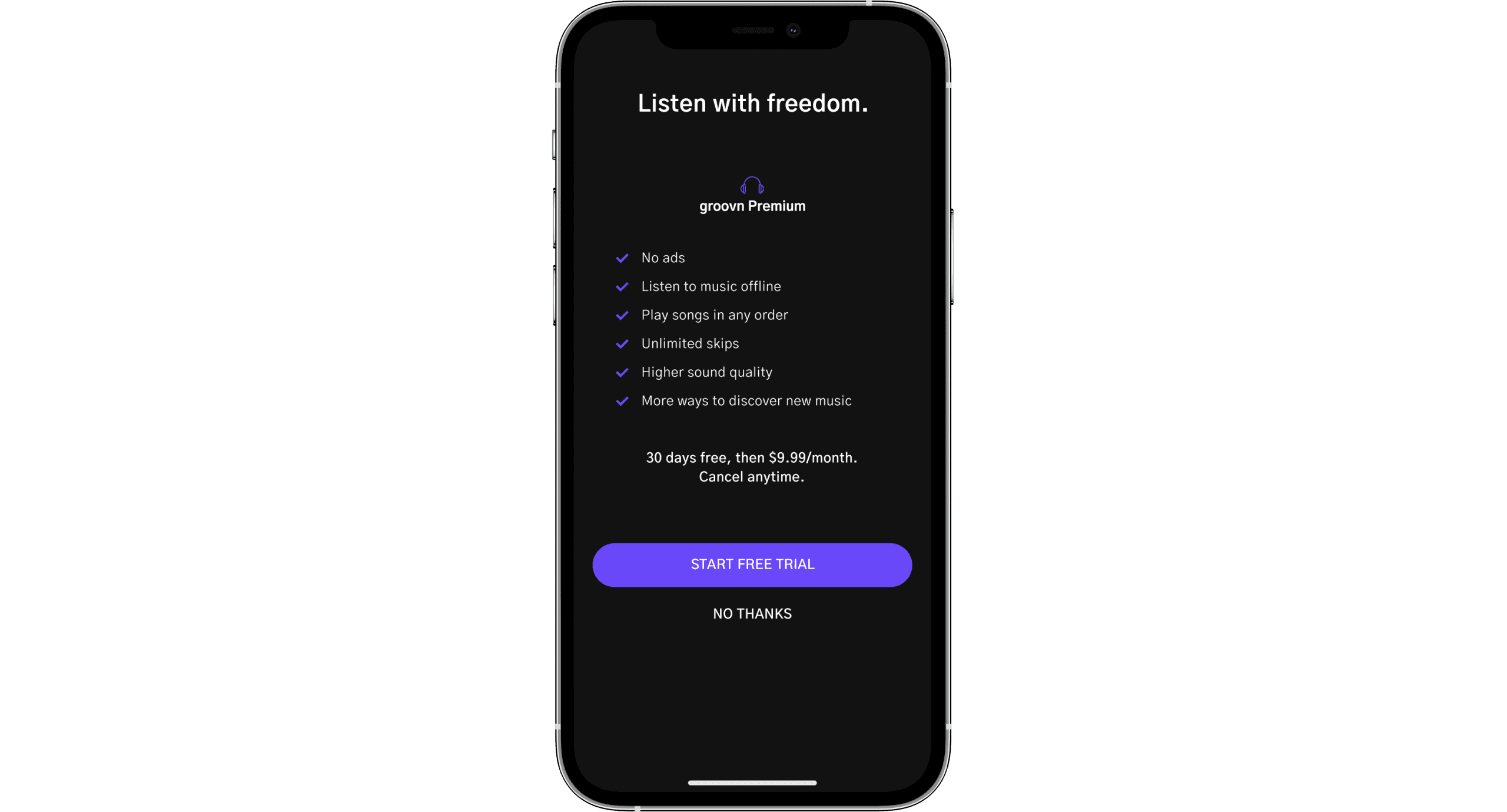
The user is not prompted to upgrade until they are in the app. This gives them a chance to preview the product before choosing to upgrade to premium.
Upgrading to Premium
There are multiple calls to upgrade throughout the free version of the app.
When the user is listening to music, they will see an advertisement every few songs, prompting them to upgrade.
Based on user feedback, I wanted to keep this as quick and simple as possible to make sure all users will decide to proceed with the free trial.
Listening to Music
The user can access their saved playlists to start playing music. Through there, they can skip through songs. On the media player, the user can access the queue, see what song is next, and view additional options. I used the album artwork to keep the UI bold and visually appealing.
Additional Features
Some fun features that users will get full access to if they upgrade to premium include friend and artist feeds, where users can follow friends to see what they last listened to, and artists to see their new uploads. Users have access to playlists organized by mood and activity, with their most listened to at the top in the search screen. Premium users have the option to play any playlist in party mode, where the songs in the playlist are shuffled according to key and bpm, and crossfaded between songs. This provides a seamless listening experience, almost like there's a DJ in your pocket.
Results
I was faced with the challenge of not only designing a "cool" music app, but one compelling enough to make users pay a monthly subscription to use it.
Because so many products like this already exist, it was fairly simple to gather information about what works and what doesn't. The challenge came in when questioning how far I can go while trying to convince existing users to upgrade. How easily do users get annoyed by pop ups? What visual barriers cause users to delete apps?
Through multiple rounds of testing, I was able to remove this challenge completely. I found that most people expect barriers if they do not pay for a media streaming service, and that the prices are usually worth paying for at some point. Adding in ways to upgrade throughout the user flow that aren't visually obtrusive turned out to be the key of not turning any users away.
